


Circular visualizations are a mixed back. I have seen my share of radial plots or chord diagrams that were too complicated to make sense - and I have mixed feelings about donut charts. But in the right context, circle shapes dashboards can be incredibly effective. They’re not just visually appealing; they can also be intuitive and practical.
In this article, I’m highlighting three examples of circular dashboards that I find both striking and useful. Each leverages the circle to represent events over a specific time cycle: a 32-hour fasting period, a menstrual cycle, and a single day.
And don’t miss the common thread here - yes all of them use the circle to represent a rhythm, series of events, or repeating target over time.
1. Easy Fast: Tracking Metabolic Milestones
The app Easy Fast uses a circular dashboard to visualize fasting progress in an intuitive and motivating way. At the center, you see how long you’ve been fasting, while the circumference of the circle tracks your progress through different metabolic milestones, like fat-burning or autophagy. These milestones “light up” around the circle as you hit them, providing an instant sense of accomplishment.”
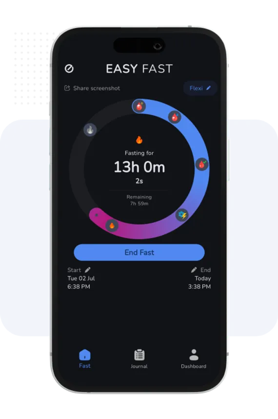
Clicking on a milestone brings up a detailed pop-up with references to scientific literature. This kind of transparency builds trust and adds credibility—a design choice more apps and dashboards could benefit from.
I discovered Easy Fast while exploring the health benefits of fasting, which surprised me as someone who grew up believing “breakfast is the most important meal of the day.” (Spoiler: it still is—but not because it’s a morning meal. It’s about how you break your fast that matters.) Easy Fast helped me better understand the body’s natural processes during fasting, and its design makes sticking to the practice easier and more rewarding.
You might have noticed there’s a little “dashboard” icon in the lower right. That part actually isn’t arranged very well, but we won’t go there today.
2. Clue: Seeing the Bigger Picture of Your Cycle
The Clue app uses a circular dashboard to track the menstrual cycle, and it’s a brilliant example of how a well-designed visualization can make complex information easy to digest. The circumference of the circle represents the entire cycle, and a round white marker helps pinpoint the current day. The circle is segmented into different phases, such as menstruation, ovulation, and fertile windows, with a clean, minimalist aesthetic that balances information density with readability.
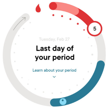
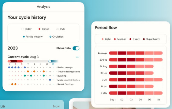
The interactivity is another standout feature. You can move the marker to explore upcoming days or click on specific sections to unlock more detailed insights about that phase of the cycle. And for those who want even more data, Clue offers calendar and analytics views that aggregate averages and ranges for cycle length, period duration, and more.
It’s a masterclass in user-friendly design: easy to navigate, informative, and visually pleasing without being overwhelming.
And, as someone who is both a data nerd and a woman, I absolutely love the company’s slogan: “It’s not in your head. It’s in your data.”

Taking ownership of your own health data can be a very empowering experience for anyone wanting to better understand their health, but it this slogan is especially striking given the historical underrepresentation of women in clinical studies and misdiagnosis or dismissal of health issues for many women.
3. Fitbit: Closing the Circle
Circular dashboards are also a natural fit for daily step counters like Fitbit. Here, the circle doesn’t fill based on the passage of time; it fills as you move closer to your daily goal—whether that’s steps, active minutes, or calories burned. The visual of “closing the circle” is deeply satisfying, especially for tasks that reset daily.
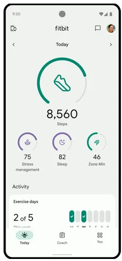
This approach feels intuitive for habits and goals tied to a repeating cycle, like exercise. It also translates beautifully to smartwatch displays, where space is limited (and often circular). Fitbit’s design proves that circles aren’t just about aesthetics—they’re about conveying progress in a way that feels natural and motivating.
The Right Shape for the Right Data
What makes these circular dashboards work is their alignment with the natural rhythm of the data they’re visualizing. Fasting, menstrual cycles, and daily activity all follow time-based cycles, making the circle not just appropriate but ideal for representing them.
Now it’s your turn: Do you have data that repeats in a time cycle? Maybe it’s a monthly business process, a quarterly workflow, or even an annual performance review cycle. Circular dashboards like these could offer a fresh way to visualize and understand that data.
So next time you’re designing a dashboard, think about whether a circle could be the perfect fit for your data story. Let’s go in circles—intentionally. 😊
As a dashboard designer, I share your mixed feelings about circular visualisations. Thank you for providing such practical examples of where they can truly shine—it's given me a fresh perspective on how to approach circular designs in the right context!