

The 10 most annoying mistakes that newbie dashboard builders make (No 2)
No worries if you're "not a color person" - black and white is good too!

As a hiring manager for data visualization and dashboard developer roles, there are more than a few things that candidates do that drive me bonkers. In this series of ten common dashboard mistakes, I’m sharing number two.
The topic for today - misuse of color.
Too many job seekers (or, truth be told, established data analyts) use the default colours in whichever software they are using. Nine times out of ten, these colours are not a good choice for a final product. If you’re using Microsoft Excel, Power BI, or Google Sheets - the problem is even worse. Honorable mention here for Tableau, which has quite a nice palette set. But still - you shouldn’t keep the defaults unless you’ve scrutinized them carefully.
The main problem with default colours are:
Too much variety of color, which adds meaningless noise
Colors are too bright and saturated, they are all “loud”
Colors aren’t selected for meaning
Here is an example I sketched of Jurassic Park critic ratings from the website Rotten Tomatoes. By default, many dashboard or data visualization software applications will produce legends like this, using a nonsensical smattering of colours.
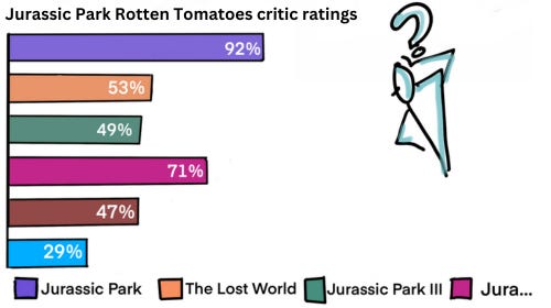
Do you see some other issues with the graph above? If you noticed the legend labels are cut-off and not completely legible, good for you! This is SO common among Power BI developers. Please please make sure your legend items are legible, friends! Otherwise no one is going to be able to properly interpret your report.
I sketched an alternative that uses the colors from the Rotten Tomatoes rating system to help highlight just how much most of the Jurassic Park movies sucked.
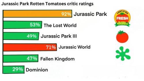
When I look at this second graph, it’s much easier for me to see that the first movie is the only one that was “Certified Fresh,” and that each of the trilogies started off (relatively) strong but dropped with each sequel.
You’ll probably notice that the colors in the second graph aren’t needed at all, because I used text labels instead of a color legend. You’re right. Here the colours are just an extra layer that isn’t critical to interpreting the data.
And despite my suggestion that the use of the Rotten Tomatoes colors is clever, they are problematic too — because around 2-5% of the population can’t effectively tell red and green apart.
Generally speaking, it is recommended to design your dashboards to preserve all key content in gray scale.
So here are my dashboard color tips for you:
Never keep the default colors that your software pumped out (unless you’re using a company theme template, in this case it might be ok).
Use color intentionally - make sure that added color adds meaning and not just visual noise.
Tone down your color set - by adding transparency if you have to - so they don’t “shout” unless you’re trying to highlight something specific.
Check your dashboard to make sure it would still make sense if you printed it in black and white. Ideally it should. Your design will be more robust for the range of eyeballs that might need to see it.
How do you use color in your data visualization work? Is there anything you’ve found that works particularly well?
Love the Jurassic Park example!