

Wrong Decimal Places: Avoid This Simple But Surprisingly Common Rookie Mistake
Number 3 out of the 10 most annoying mistakes junior analysts make

When I’m hiring data analysts, dashboard developers, or data scientists, it is a big red flag is when a candidate uses an inappropriate number of decimal places or “significant digits” in their reports.
Some fictional examples of what NOT to do, but for which real-life equivalents are shockingly common:
The survey had “87.00” responses
“66.6%” of my neighbor’s nine cats are black
The average reported salary was “$64,877”
Listen, friends - using too many digits in your figures is a rookie mistake. Follow the principles below and avoid losing credibility or at the very least, avoid annoying me.
Don’t cut up my pet pig
I am surprised I have to write this, but please don’t use decimal points when you’re counting whole things. You would never write that you have 3.00 pet pigs, or that your fan club has 57.00 members, for example.
And if you’re reading this, you might be wondering how an analyst would find themselves doing adding these ridiculous “.0” decimals in the first place - and I would say it’s probably driven by a misapplied number format or software default that the report developer either didn’t realize needed changing or couldn’t be bothered to change.
Please be bothered. Whether you're counting people, products, pets, or otherwise, stick to whole numbers to keep your data clean and logical. Click the → .0 button and fix it. You will at least make 1.00 report consumer happier.
So you got digits? That don’t impress me much
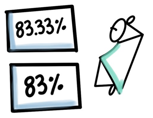
When you use decimal points, you're indicating a level of precision in your data, that might not actually be there. For example, say you observe that 37 out of 124 attendees at an event are wearing blue jeans. If you punch that into a calculator, it’s 29.8387%. But if you put all those digits into a report, or even if you put 29.8%, it implies a value more exact than is appropriate.
Generally, you should instead follow the rules of significant digits (a.k.a. significant figures). In the example, 37 has two significant digits, and 124 has three. The figure you produce should be restrained to the same number of digits as the smaller of the two. In the example, rounding to 30% is more correct and appropriate.
Bonus, it’s a lot easier for your reader to understand and remember 30% versus 29.83-whatever-it-was. Your simpler figure will be both more correct and more effective.
Other gotchas are presenting too many decimals for the instrument that is doing the measuring, for instance you can’t use a regular wooden ruler and see 5.62cm.
And it’s not just about decimals. Sometimes you need to round even more to get the most appropriate number of digits. Like $3M instead of $3,230,023 or what-have-you.
Help me see importance on the right scale
Decimals can show a level of detail is often unnecessary and can overwhelm your audience. It's important to match the precision of your data to the context and significance of your report.
Even if your company’s bank balance is precisely $1,234,567.89, on a dashboard, showing the exact dollars and cents is likely overkill. Think about the right level of detail that the report consumer needs to understand, gain insight, and take action.
In 2024, our eyeballs and brains work daily to sort and process the largest volumes of data ever produced by humankind. Please do not add to the burden by adding unnecessary digits to simple figures. You will make the information in your report more difficult to consume and ultimately it will hurt your information products and your career.
Go simpler until you lose important meaning, then add back detail
One approach that I have found works well is to see how much rounding you can get away with before some insight or meaning is lost that will matter to your target audience.
You might be surprised how few digits are really vital. For many audiences, the “headline” version of the figure is all that is needed. That might change a 104.92% increase to simply “2x”. That’s going from five digits to one, if you didn’t notice.
Exceptional exceptions
Of course, in some cases, you will need to include every penny (or equivalent). There are situations when your report consumers will need the most exact numbers that are true and correct given the instruments of measurement and significant digits. Just don’t be fooled or fool your audience where extra digits are artifacts of division, like 29.83% jean-wearers - that imply a false exactitude.
There are also exceptions for industry standards, like these Paris 2024 Olympic scores behind Team USA’s gold medal in Artistic Gymnastics:
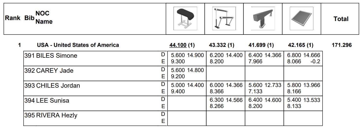
At first glance, one could argue that the three decimal places are unnecessary (unless there were .001 or event 0.01 penalties). Since all the scores end in -00, -33, or -66, the last digits look pretty meaningless, and mostly like an artifact of the number of judges… But the all the decimals count towards the team total scores. In this context, I wouldn’t drop them. They’re well earned!
Do note, however, that headlines won’t say the team scores “171.296" - many simply say that Team USA “won.” And that’s some very effective rounding indeed! Down to binary!
Take away
Remember, chances are good that scaling back the precision in your reporting will actually be doing your audience a favor. Try seeing how many digits you can round off before losing granularity that your audience actually needs. The result may both surprise you and delight your clients.
And for goodness sake, don’t add extra decimals just because they showed up in your calculation outputs. Like free airport Wi-Fi and political polls, you just can’t count on them to deliver meaningful results.
For other mistakes to avoid, check out: